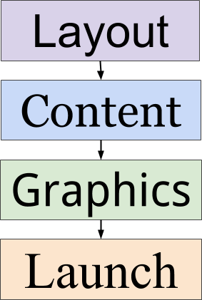
4 Stages of Web Design and Development
Web design and development first serves an online marketing purpose and second serves a graphical purpose. Anyone who thinks the other way around is designing a website that will undercut audience and especially revenue.
Some graphic designers may hate that statement. But they don’t have to pay the bills.
Ask people their opinions about certain websites. Wait to see if they talk about beautiful graphics or about such issues as speed, functionality, ease of finding content and other experiences. Website visitors who provide feedback almost always talk about the latter.
Someone responsible for a site has made the design more important than the audience when:
- The main body type is a light or medium gray color, which reduces legibility.
- Graphics are too large and not optimized for fast loading.
- The home page requires many pages of scrolling.
- The width is set for the widest possible resolution because the site staff has large monitors.
- Each page is jammed with excessive server calls to ads, plugins and other products and services, which slow page load.
Web design and development is part of a broad business strategy and not a playground for special interests. Designers with too much freedom can turn the site into their personal playground. Management with responsibility for profits and advertising people who have to deliver revenue do the same when:
- Every page has more than three or four display ads.
- The ad images are not optimized.
- Ad placement crowds out content that users value, which is probably the reason why they came to the site in the first place.
Design is a process of prioritizing stages in site development. Let’s look at four identifiable stages as part of a process from beginning to launch.
Stage 1: Architecture and Layout
Site architecture starts with code on the templates that determines the presentation of each major element — text, graphics and ads. But this step doesn’t mean the designer should fill those spaces quite yet. Instead, the design should simply show a series of empty boxes.
Doing the layout first will encourage code simplicity. Code simplicity results in fast page load speeds, less ongoing maintenance and often in lower costs (labor and bandwidth). Putting it another way, a page with 15k of HTML and 30k of CSS is much easier to maintain than 150k and 300k.
Architecture also involves the functionality that is displayed via the templates, such as commenting, search, RSS, etc.
Layout, also known as the wireframe, takes those decisions about architecture and leads to decisions about where to position certain types of content and site features.
Viewing a layout in the form of a simple set of CSS-driven borders and boxes will help confirm if the initial decisions are correct.
Presenting a layout without any actual text, graphics or ads — in other words just presenting a structure of boxes showing the placement of major elements — will force management and team members to focus on core business goals. They will think conceptually and strategically rather than just visually. The visual part comes later.
Stage 2: Content, SEO and Navigation
Content Decisions
Now that a rough layout is in place and the team is in agreement, it’s time to lay in the actual content. It’s likely the content is dividable into a set of specific subjects.

Credit: Pixabay Creative Commons license
Prominence is a key element in Web design and development because it impacts user experience, click rates and search engine optimization. The value of each element should determine its prominence. The value of an element is determined by its ability to deliver audience and revenue.
For example, an article that gets high placement in search engine results should appear more prominently on the site if moving it will deliver an even higher rank.
A 300×600 display ad that commands higher CPMs and click rates should appear more prominently than a 300×250 with lower CPMs and click rates.
Navigation Decisions
A site that uses a main navigation bar at the top of the page in a horizontal dimension has a limit to the number of items it can contain.
Most sites will find a limit of about seven or eight navigation items. Any more will usually require displaying them in a smaller font to make them fit, which leads to fewer clicks by visitors.
Trying to display more items will results in three common options:
- Creating a dropdown menu off the main navigation bar, which visitors rarely use.
- Developing a static secondary navigation bar that appears below the main navigation or above the header.
- Creating a more extensive static navigation at the bottom of every page.
The more navigation items a site displays, the more code that is required.
SEO Decisions
SEO research will help identify the best keywords to use to describe the subjects. Publishers can use them to name each section front and the anchor text used in navigation (or at least influence the naming of them).
Stage 3: Graphics, Colors and CSS
It is useful and interesting to review a web design prototype with nothing but raw content, navigation and links and leave out the graphics altogether.
It forces the designers and managers to look at the site in terms of content and functionality.
Too many times I’ve seen people swayed by the look of a site against other priorities. The graphics command their attention and make them completely overlook the content and functionality.
Once the raw site has been reviewed by all of the project stakeholders, THEN it is useful to implement graphics, colors and CSS and let them review it again.
Stage 4: Launching, Analyzing and Revising
The internal review is complete and the site is ready to go live. But that step of launching means that another review is about to take place — the public one.
A thorough review of analytics will show whether the design is working. One of the simplest ways of judging the public response is pages per visit and time on site.
A high pages per visit number says that the public is clicking around, finding content and experiencing a site that is loading in an acceptable amount of time.
A low pages per visit number says just the opposite. In this case, analyzing audience numbers to identify pages with high exit rates is essential for correcting problems.