Basic Web Design Covers 9 Important Steps

Basic Web design is appropriate for the great majority of sites because they are limited by how much time they need and what they are trying to accomplish.
What is basic Web design? It is a strategy of designing a site in the simplest way possible because simple sites require less time, money and effort to maintain. Simplicity means using the least HTML and CSS code possible.
Sometimes it’s easy to get caught up in what it takes to produce great websites and lose focus on what most people can afford or have time to do.
With that in mind, let’s review nine steps in that allow anyone to develop a basic web design with minimal cost and effort.
1) Mission
Businesses, associations, media outlets, government agencies and charitable organizations all have a different mission.
That mission should mostly carry itself into the website, but sometimes not entirely.
A website is a different animal with different capabilities. It’s important to understand which of those capabilities work best for the organization.
A revised mission may reflect the fact that a Web audience skews younger and wealthier than the average population.
So the theme should be reviewed with organizational needs in mind, but also with the audience in mind.
2) Goals
The review of mission and vision should lead to a definition of goals.
Potential goals include:
- Mass audience
- Niche audiences
- Transactions
- Subscriptions
- Donations
- Advertising revenue
- Brand development
Because websites have great flexibility in what they can do, it’s important to prioritize the goals and then develop measurable objectives.
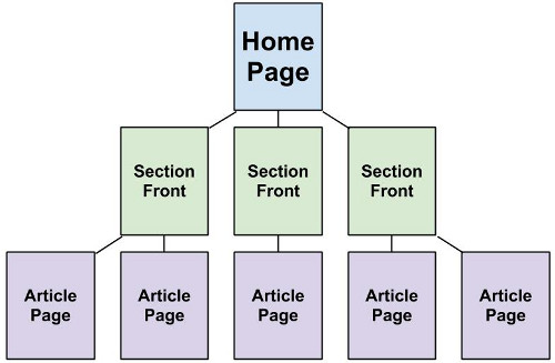
Design a site architecture on paper to grasp navigation and create orderly content.
3) Architecture
Thoughtful goals and objectives lead to the development of a thoughtful website architecture.
Use a piece of paper and a pencil to create a site structure beginning with the home page at the top of the paper with links from that page to a second row of pages.
The second row of pages will represent either the final pages for a small site or the “channel” fronts for a mid-sized or large site. The channel fronts represent major categories of content.
Place more links from the second row to a third row of interior pages containing the articles for mid-sized sites or subcategory pages for large.
For large sites only, a fourth row is next that contains the articles. But it should be the last row. No content should be more than three clicks away from the home page. Otherwise, visitors and even search engines will have a harder time finding it.
4) Layout and Navigation
Now that the theme, goals and architecture are realized, the layout and navigation should be easier to develop.
Again using paper and pencil, create the layout of the home page. Consider the following placements:
- Logo / brand
- Navigation bar
- Lead content element
- Secondary content elements
- Functionality such as polls, galleries, etc.
- Advertising (if any)
Try to avoid putting too much on the page because plenty of research shows that people limit how much scrolling they do in a browser. Click-through rates drop the farther down the page they go.
5) Graphics
A common mistake in basic web design is making graphics the most dominant element on a page.
A site’s success or failure relies on its usability and the experience of the users.
If the graphics make the page slow to load or inhibit clicks, the goals and objectives will be harder to achieve.
Try to judge the ratio of graphics to text on the page to see if it strikes the right balance. Make sure to optimize the graphics for faster page load.
6) Prototype
At this point it’s possible to create a prototype on a development server or a live environment that is not viewable by the public.
A prototype makes it easy to judge the previous steps.
Does the layout look clean and well organized? Does the navigation reflect the goals and objectives? Is it easy to find the most important pages and functionality?
Get feedback from multiple people to find a consensus. Be aware that feedback is often subjective and inconsistent. Make adjustments as necessary.
7) Content
People read on the Web differently than they read in books, magazines or newspapers.
They tend to skim more and look for specific pieces of content rather than read an entire article at a leisurely pace. They harvest information in small pieces.
As a result, it’s wise to keep sentences brief and paragraphs only one or two sentences long if possible.
Use subheads frequently. If the article is long, consider an index at the top of the page with code that jumps to a section down below.
8) Publishing
Sometimes it’s tempting to rush to the publishing moment and make the site live to the public.
It is a good idea to have as many people as possible review the site a second time, whether they are co-workers, friends or family members.
Ask them how quickly the site loads, whether they found it easy to navigate and if they have any suggestions or problems.
Once this last round of feedback has been processed, it’s time to go live.
9) Analysis
 The final and biggest test of a basic web design will come from the public in the form of emails, phone calls or analytics.
If the site is new, the emails and phone calls are usually minimal. If it’s a replacement site, they will come more often.
But the most important feedback is the site analytics. Analytics are factual and objective rather than made up of subjective opinions.
In site analytic reports, look at “bounce rate” and “pages per visit” to see how people are using the site.
Bounce rate is the number of people who come to the site, view one page and leave again. A bounce rate above 60 percent is bad, between 40 and 60 percent is decent and lower than 40 percent is excellent.
Pages per visit is self explanatory with higher being better. A minimum of 2.0 is essential. Anything above 3.0 is a good goal to pursue.